Homepage example
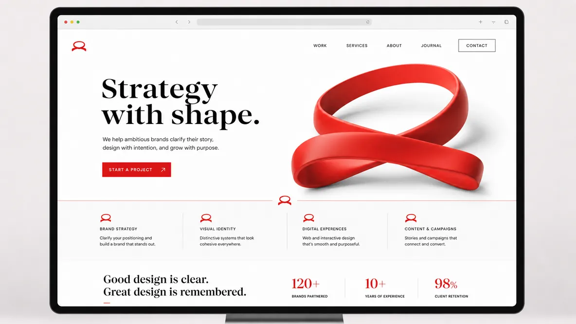
Homepage focus
A signature color, shape, phrase, object, or motif repeated across the hero and service cards.
Build the cueColor system
Blackgreen#1E2320 / Contrast
Signal Red#D84B2A / Signature
Gold#F2BC3A / Recall accent
Sand#F8F0E4 / Page base
White#FFFFFF / Relief
Typography
Bold & Memorable
Use one repeatable brand cue so visitors remember your business after they leave.
- Heading font
- Archivo Black for a repeatable voice.
- Body font
- DM Sans so the motif stays memorable.
- Copy style
- Repeat one phrase, visual cue, or object deliberately.
Key page sections
- Hero built around the cue
- Why the cue matters
- Proof using the motif
- Services with repeatable icons
Proof to feature
- Recognizable brand object
- Social proof
- Memorable copy
- Pattern or icon system
Assets to gather
- Logo detail
- Custom icon or symbol
- One hero object
- Pattern tiles
Practical takeaway
Visitors should leave with one visual idea stuck in memory.