Homepage example
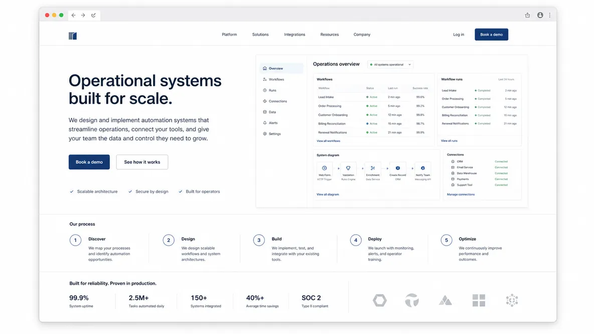
Homepage focus
A specific outcome claim, a process diagram, proof metrics, and case-study evidence.
See the processColor system
Charcoal#243133 / Headlines and structure
Teal#2F6F73 / Primary action
Steel#6F8790 / Data accents
Ice#E8F0EE / System panels
Signal#C8A45D / Proof highlight
Typography
Expert & Proven
Use evidence, process, and technical clarity to reduce risk before visitors inquire.
- Heading font
- Sora for precise headings.
- Body font
- IBM Plex Sans for readable technical detail.
- Copy style
- Specific proof over persuasion; show how it works.
Key page sections
- Specific outcome hero
- Process map
- Case study proof block
- Credentials and FAQ
Proof to feature
- Metrics
- Case studies
- Certifications
- System screenshots
Assets to gather
- Dashboard screenshots
- Process diagrams
- Result summaries
- Technical screenshots
Practical takeaway
Visitors should feel these people know exactly what they are doing.